Text
Introduction
Pamela Text is a shape to draw some beautiful text into the canvas. This shape doesn’t only handle its drawing, but also implements editing controls. If specified, a text can became and easy-editable text, offering an inline textarea to modify its contents.
Main features
These are the main features Pamela.Text shape:
Mono-styled text drawing (including font configuration and padding)
Advanced border formatting (including dashed borders and rounded rectangles)
Text editing (on double click over the shape)
Dynamic font controlling (calculated to fit the container)
Fixed size textboxes (including editing controls to make it fit)
Icons rendering (correcly renders unicode icons)
Alignment controls (justify, center, left, right, etc…)
Spellchecking controls (during editing)
Resizing policies
Cut/copy/paste on editing and auto resizing
Auto font size decrease to make it fit to the container
Simple text
To display a simple static text into a Pamela.Stage, you can use this simple code:
const s = new Pamela.Stage({
  container: 'id',
});

const l = new Pamela.Layer();
l.add(new Pamela.Text({
  text: 'My simple text',
  width: 200,
  height: 200,
  fill: 'blue'
}));

s.add(l);This will draw a static blue text My simple text into the stage, contained into a box of 200x200. By default, every text is non-editable. Property text specifies the text to render. It can also be a multiline text, containing unicode characters.
The specified text will be adapted into its container (of the given width and height).
If a text cannot be fully contained into the container, it will be truncated until the last representable character. This behavior can be controlled using ellipse property
fill Indicates the text foreground color, not the background. Its default value is 'black'
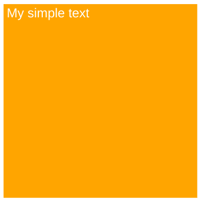
Text with background
What if we want to create a text with a background color? In this example, we’ll create a white text on a orange background, with a fontsize of 20pt and a padding of 5px. It will be contained into a container of 300x300.
l.add(new Pamela.Text({
  text: 'My simple text',
  width: 300,
  height: 300,
  fill: 'white',
  backgroundColor: 'orange',
  fontSize: 20,
  padding: 5,
}));Very simple. Property backgroundColor specifies the background color (solid) of this shape. It will be rendered drawing a rectangle of width * height area, starting from topleft corner. The color can be specified following the https://revodigital.atlassian.net/l/c/cejqFFTT .
Result
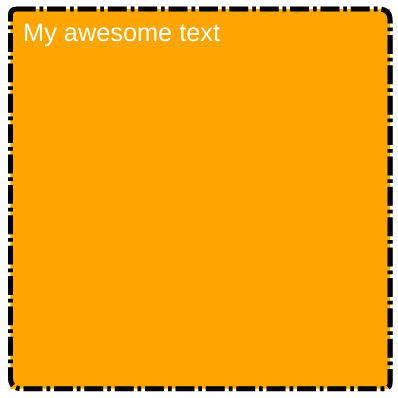
Bordered text
Text also supports advanced border configuration. Lets re-use the same text as before and add a red dash-dotted border of 2px width and with a diagonal border radius (topleft and bottom right at 20px and others to 15px).
l.add(new Pamela.Text({
    draggable: true,
    fontSize: 20,
    text: 'ciao',
    fill: 'white',
    padding: 20,
    width: 300,
    height: 300,
    borderColor: 'black',
    borderWidth: 2,
    bordered: true,
    backgroundColor: 'orange',
    borderRadius: borderRadiusDg(5, 9),
    borderDash: LineDash.DASH_TRIPLEDOT,
}));Result
This is the rendered result:
Editable text
Making a text editable is very easy now, just set the editable option to true. Pamela will do the rest of the work for you.
const t = new Pamela.Text({
  editable: true,
  ... rest
})Now, our text is completely editable. This means that when we will double-click on this text, it will show up an editable area to change its contents. To exit, press Enter and the text will be stored and rendered into the shape.
Fixed size text
To force a text to fit into its container during editing, pass lockSize with true value. By default it is false. This will only allow font size to decrease. During editing, text won’t be able to cause a resize of the container. When there will be too text for the actual container, it the fonsize will be greather than 6pt, it will be decreased to make all fit. If fontsize will be too little, then the container will resize following GrowPolicy.
Dynamic size text
Letting lockSize empty or by setting it to false, text will be resizable during editing. When new text will overflow current container, it will cause a resize of the shape. How can i control this resize? Using growPolicy. It indicates if the text should keep its original width and grow in height or the opposite. If lockSize is true it is used only on font size <= 6pt.
So if i set growPolicy to GrowPolicy.GrowHeight and the text starts overflowing, its height will be increased to make it fit. The same happens for GrowWidth. The default value is GrowHeight.
Spellchecked text
Pamela.Text also supports spellchecking while in editing mode. To enable it, just pass spellcheckOnEdit: true to his configuration or set it via text.spellcheckOnEdit(true). By default it is disabled, but it can be useful sometimes.
Experimental feature - font size grow
Another option is expandToFit, it is meant to make fontsize grow to fit its container while in lockSize = true. Normally, the fontsize is decreased when text is too long. With this option enabled, text font size will grow when there will be some free space available. This is still under testing.
Text properties
This is a complete list of text configuration properties.
User interaction properties
They control how the user can interact with this text.
Property | Type | Description |
|---|---|---|
|
| Enables / disable editing on double click |
|
| Indicates if boundaries of this shape are fixed or can grow while editing |
|
| Enables / disables spellchecking during editing mode |
|
| Enables / disables custom line break (via Shift + Enter) while editing. If false, there will be no-way to insert line breaks |
|
| Enables / disables experimental font size grow |
|
| Indicates how text boundaries should be resized in editing mode |
Borders
They define border configuration for this text.
Property | Type | Description |
|---|---|---|
|
| Enables / disables border rendering |
|
| Sets the Border radius |
|
| Border color |
|
| Configures line dashing, to create dashed or dotted borders |
|
| Configures line cap of border |
Style configuration
Property | Type | Description |
|---|---|---|
|
| Background color of this text |
|
| Font family |
|
| Font size |
|
| Font style |
|
| Font variant |
|
| Text alignment |
|
| Letter spacing |
|
| Vertical alignment |
|
| Internal spacing |
|
| Line height (1 is normal) |
|
| Text decoration |
|
| Content of this text |
|
| Wrap mode |
|
| Enable / disable ellipsis |
|
| Placeholder text |
Useful methods
Pamela.Text also offers some useful methods.
Method | Parameters | Description |
|---|---|---|
|
| Resizes this shape following growpolicy |
| No parameters | Calculates a new fontsize to perfectly fit its container boundaries |
| No parameters | Calculates current text height in pixels |
|
| Calculates current text height using a specific font size instead of shape one |
|
| Sets a new text |
| No parameters | Enables editing for this text |
| No parameters | Disables editing |
| No parameters | Returns a measurement helper to make measurements on text |